Home
About
Overview
Why Novo
Testimonials
Blog
Services
Website Design & Development
Mobile Application Development
Open Source Development
Maintenance, Upgrades and Support
SEO & SEM Services
Design & Multimedia Services
PSD Conversion Services
Technologies
Android Application Development
HTML / CSS
jQuery / Ajax
iOS Development
PHP
Portfolio
Careers
Contact Us
Request a Quote
Previous Image
Next Image
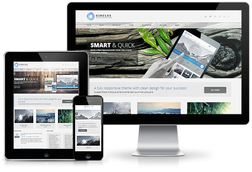
multi_device1
Post navigation
Published in
Custom Web Applications